Mobile Shopping Trends 2025: Is Your Shopify Store Ready?
The smartphone in your pocket has become the world's most powerful shopping mall. As we navigate through 2025, mobile commerce isn't just a trend; it's the dominant force reshaping how consumers discover, browse, and purchase products online. If your Shopify store isn't optimized for mobile shoppers, you're not just losing sales; you're watching your competitors capture the customers who should be yours.
The Mobile Shopping Revolution: By the Numbers
The mobile shopping trends 2025 landscape reveals a fundamental shift in consumer behavior that no e-commerce business can afford to ignore. Recent data shows that mobile devices now account for approximately 76% of all e-commerce traffic, with mobile sales representing over 60% of total online transactions. This isn't a gradual evolution; it's a complete transformation of the digital marketplace.
What's even more striking is how consumers are using their mobile devices throughout their shopping journey. Research indicates that 85% of shoppers use their smartphones to compare prices while standing in physical stores, while 73% conduct product research on mobile devices before making any purchase decision. The average consumer checks their smartphone 96 times per day, and a significant portion of that time involves shopping-related activities.
For Shopify store owners, these statistics translate into a clear reality: mobile e-commerce is no longer an alternative channel; it's the primary channel. Consumers expect seamless mobile experiences, and they're willing to abandon stores that don't deliver. In fact, studies show that 57% of users won't recommend a business with a poorly designed mobile site, and 40% will visit a competitor's site instead.
The mobile conversion gap remains a critical challenge for many online retailers. While mobile traffic dominates, mobile conversion rates still lag behind desktop in many stores, not because mobile shoppers are less serious about purchasing, but because mobile experiences are often frustratingly inadequate. The average mobile conversion rate hovers around 2.2%, compared to 4.8% on desktop, representing billions in lost revenue across the e-commerce industry.
Understanding Mobile Shopper Behavior in 2025
Today's mobile shoppers exhibit distinct behavioral patterns that differ significantly from desktop users. Understanding these patterns is essential for mobile Shopify optimization. Mobile sessions are typically shorter but more frequent. Shoppers often browse during micro-moments: waiting in line, commuting, or during brief breaks, making speed and efficiency paramount.
Mobile shoppers are highly intent-driven. When they pull out their phone with a specific product in mind, they expect to find what they need within seconds. Navigation must be intuitive, search functionality must be powerful, and product information must be immediately accessible. Any friction in this process triggers immediate abandonment.
The role of social media in mobile shopping has exploded in 2025. Instagram, TikTok, and Pinterest drive massive mobile traffic to e-commerce stores, with social commerce sales expected to reach $80 billion in the United States alone. Mobile shoppers frequently discover products through social platforms, make split-second decisions, and expect seamless transitions from social apps to online stores.
Visual content dominates mobile shopping behavior. High-quality product images, videos, and user-generated content significantly influence purchasing decisions on mobile devices. Shoppers zoom, swipe, and interact with product visuals in ways that desktop users don't, making responsive image optimization crucial for conversion success.
Payment preferences have also evolved. Mobile wallet adoption continues to surge, with Apple Pay, Google Pay, and Shop Pay becoming preferred checkout methods. The friction of manually entering credit card information on a small screen is enough to drive abandonment, making one-click mobile payment options essential for maximizing conversions.
The Mobile Shopping Frustrations Killing Your Conversions
Despite the mobile shopping boom, countless Shopify stores fail to deliver satisfactory mobile experiences. Understanding these common frustrations is the first step toward fixing them and capturing the revenue you're currently losing.
Slow Loading Times: The Silent Conversion Killer
Nothing frustrates mobile shoppers more than waiting for pages to load. In 2025, consumer patience has reached an all-time low: 53% of mobile users abandon sites that take longer than three seconds to load. Every additional second of load time can decrease conversions by up to 20%.
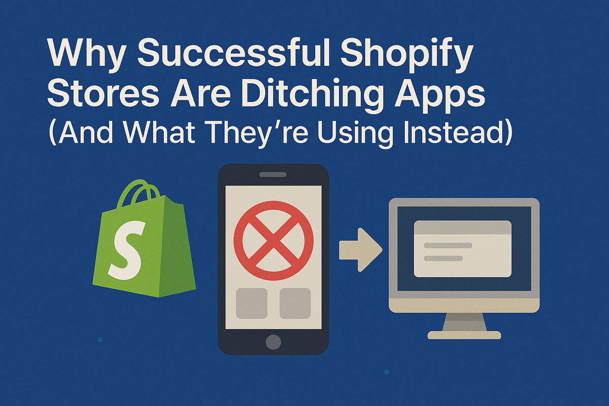
The problem compounds when store owners install multiple Shopify apps without considering their performance impact. Each app adds code, scripts, and external requests that bog down your site. What might feel like a minor delay on your office computer can translate into an agonizing wait on a mobile device with a spotty connection.
Booster Theme eliminates this critical bottleneck entirely. As one of the fastest Shopify themes available, Booster loads practically instantaneously, even on slower mobile connections. More importantly, Booster's 40+ built-in conversion-optimized marketing tools mean you can save $281/month in app subscription fees while actually improving your store's speed. Instead of installing separate apps for countdown timers, product badges, size charts, and other essential features, Booster includes them natively, ensuring your mobile site remains lightning-fast while delivering all the functionality you need.
Ready to give your mobile shoppers the lightning-fast experience they demand? Discover how Booster's mobile-first design eliminates slow loading times and delivers instant page loads even on slower connections. Visit boostertheme.com to transform your store's mobile performance today.
Difficult Navigation and Poor User Interface
Mobile screens offer limited real estate, yet many Shopify stores treat mobile navigation as an afterthought. Cramped menus, tiny click targets, and buried search functionality make it nearly impossible for shoppers to find what they need. When users can't locate products within seconds, they simply leave.
Common navigation mistakes include overly complex mega-menus that don't translate well to mobile, category structures that require excessive scrolling, and search bars that are hidden or difficult to access. Mobile shoppers need clear, thumb-friendly navigation with prominent category links and an always-accessible search function.
Product pages present their own challenges. Descriptions that require endless scrolling, small text that forces zooming, and critical information buried below the fold all contribute to poor mobile experiences. Size charts, shipping information, and return policies must be immediately accessible without forcing users to hunt through multiple taps and page sections.
Clunky Checkout Processes
The mobile checkout experience can make or break your conversion rate. Complex multi-step processes, mandatory account creation, and forms that aren't optimized for mobile keyboards create friction that drives shoppers straight to your competitors.
Autofill functionality often fails on mobile, forcing shoppers to manually enter information on tiny keyboards. Address validation errors require corrections that feel tedious on mobile devices. Payment security badges might not display properly, creating trust issues at the critical moment of purchase.
The most successful mobile checkouts minimize fields, offer guest checkout options, pre-populate information whenever possible, and integrate mobile wallet payment methods. Any store still using a traditional desktop-style checkout on mobile is hemorrhaging potential revenue.
Non-Responsive Design Elements
Images that don't scale properly, buttons positioned too close together, pop-ups that can't be dismissed on mobile screens: these seemingly minor issues create major frustration. Touch targets need to be large enough for finger interaction, with adequate spacing to prevent accidental taps.
Videos that don't play on mobile devices, forms that get cut off by device keyboards, and horizontal scrolling requirements all signal to shoppers that your store wasn't built with mobile users in mind. In 2025, this lack of attention to mobile detail is unacceptable and directly impacts your bottom line.
The Mobile Optimization Checklist: Essential Elements for a Responsive Shopify Store
Creating a truly responsive Shopify store requires attention to multiple elements working in harmony. Use this comprehensive checklist to evaluate and improve your mobile shopping experience.
Speed and Performance Optimization
Start with the foundation: your site must load quickly on mobile devices. Test your current mobile speed using Google's PageSpeed Insights to identify areas for improvement. Focus on optimizing images by using modern formats like WebP, implement lazy loading for below-the-fold content, and minimize the number of external scripts running on your site.
Critical rendering path optimization ensures that essential content loads first, giving shoppers something to interact with while the rest of the page finishes loading. Consider implementing a content delivery network (CDN) to serve assets from locations closer to your users, reducing latency.
Most importantly, audit your installed apps ruthlessly. Each app potentially adds hundreds of lines of code to your store. If an app isn't directly contributing to conversions or essential functionality, remove it. Many features you're paying monthly for can be achieved through your theme's native capabilities.
Mobile-First Navigation Architecture
Design your navigation specifically for thumb-friendly interaction. Primary navigation should be accessible through a hamburger menu or bottom navigation bar, with large tap targets spaced at least 44x44 pixels: the minimum size recommended for comfortable thumb interaction.
Implement a sticky header with persistent access to search, cart, and menu functions. Mobile shoppers should never need to scroll back to the top to access these critical elements. Category pages should load quickly and allow easy filtering and sorting of products without causing page reloads.
Breadcrumb navigation helps mobile users understand where they are in your site hierarchy and easily backtrack if needed. Search functionality should support autocomplete, handle common misspellings, and display results quickly with thumbnail images for easy product identification.
Optimized Product Pages
Mobile product pages must convey essential information without overwhelming small screens. Lead with a large, swipeable image gallery that supports pinch-to-zoom functionality. Display the most critical information (product name, price, and add-to-cart button) above the fold.
Use accordion menus to organize product descriptions, specifications, and customer reviews, allowing shoppers to access the information they need without forcing everyone to scroll through content they don't care about. Size charts and measurement guides should open in easy-to-read overlays or modals.
Social proof elements like customer reviews and ratings should be prominently displayed but not so intrusive that they slow down page loading. Real customer photos in reviews significantly influence mobile purchasing decisions and should be showcased when available.
Streamlined Mobile Checkout
Your checkout process should be as frictionless as possible on mobile devices. Implement Shop Pay, Apple Pay, Google Pay, and other mobile wallet options to enable one-tap purchasing. For traditional checkout flows, minimize form fields and use mobile-friendly input types that trigger the appropriate keyboard (numeric keyboards for phone numbers and zip codes, email keyboards for email addresses).
Enable autocomplete and address validation that works seamlessly on mobile devices. Display progress indicators so shoppers know how many steps remain. Allow guest checkout without forcing account creation, which studies show significantly reduces mobile abandonment rates.
Trust signals like security badges, accepted payment methods, and money-back guarantees should be visible throughout the checkout process. Mobile shoppers need constant reassurance, especially when entering payment information on a small screen.
Touch-Optimized Interactive Elements
All buttons, links, and interactive elements must be sized and spaced for finger interaction. Dropdown menus should be replaced with mobile-friendly alternatives like radio buttons or large tap targets. Forms should use native mobile input controls that work with device operating systems rather than custom solutions that often malfunction.
Avoid hover-dependent interactions entirely, as they don't translate to touchscreens. Any information revealed on desktop through hover states must be accessible through tap interactions on mobile. Modal windows and overlays need prominent, easily tappable close buttons.
Mobile-Specific Features
Leverage mobile device capabilities to enhance the shopping experience. Implement click-to-call functionality for phone numbers, making it effortless for customers to contact support. Use geolocation to suggest nearby store locations or shipping estimates based on the customer's location.
Push notifications (with permission) can re-engage mobile shoppers with personalized product recommendations, abandoned cart reminders, and special promotions. SMS marketing integration allows for direct communication with mobile-first customers who prefer text messages over email.
Testing Across Devices and Connections
Your Shopify store must perform flawlessly across the diverse landscape of mobile devices: different screen sizes, operating systems, and connection speeds. Test on both iOS and Android devices, including older models that customers still use. Verify that your store remains functional on slower 3G connections, not just on the fast WiFi in your office.
Use real device testing whenever possible rather than relying solely on desktop browser emulation. Chrome DevTools and Safari's responsive design mode are useful starting points, but nothing replaces testing on actual mobile devices in real-world conditions.
Why Mobile-First Design Is Now Mandatory, Not Optional
The terminology shift from "mobile-friendly" to "mobile-first" reflects a fundamental change in how successful e-commerce stores are built in 2025. Mobile-first design means designing for mobile devices from the outset, then adapting that design for larger screens, not the other way around.
Google's mobile-first indexing prioritizes mobile versions of websites for search rankings. If your mobile experience is subpar, your search visibility suffers regardless of how beautiful your desktop site might be. This directly impacts your ability to attract organic traffic, making mobile optimization an SEO necessity, not just a user experience consideration.
Consumer expectations have evolved beyond tolerance for poor mobile experiences. Today's shoppers don't differentiate between mobile and desktop; they simply expect your store to work flawlessly on whatever device they're using. When it doesn't, they don't give second chances; they move on to competitors who got it right.
The economics are compelling. With mobile representing the majority of traffic and a growing share of revenue, every improvement to your mobile experience multiplies across thousands or millions of visitors. A one-second reduction in mobile load time could translate to tens or hundreds of thousands of dollars in additional annual revenue for growing stores.
Mobile-first design also forces beneficial constraints that improve your entire store. When you're forced to prioritize information for a small screen, you naturally focus on what truly matters to shoppers. This clarity and focus often improves desktop experiences too, as you eliminate clutter and streamline user journeys across all devices.
The Booster Advantage: Built for Mobile Commerce Success
Creating a genuinely excellent mobile shopping experience requires more than following best practices; it requires a foundation built specifically for mobile-first commerce. Booster Theme delivers this foundation with a level of performance and customization that traditional Shopify themes simply cannot match.
Booster's architecture prioritizes speed above all else, ensuring practically instantaneous page loading even on mobile devices with slower connections. This isn't achieved through clever tricks or compromises; it's engineered into the theme's core, giving your mobile shoppers the fast, frustration-free experience they demand.
The theme's extreme customizability removes all the restrictions traditional themes impose on your store's appearance and mobile experience. You have complete control over your store's mobile layout, navigation structure, and user interface without needing to write custom code or hire expensive developers. Every element can be optimized specifically for mobile screens while maintaining design consistency across devices.
Booster's 40+ built-in conversion-optimized marketing tools eliminate the need for performance-draining apps. Features like countdown timers, product badges, trust signals, upsells, size charts, and wishlist functionality are all included natively, designed to work seamlessly on mobile devices while keeping your store fast. This saves you $281 per month in app subscription fees while actually improving your mobile performance: a rare win-win in the Shopify ecosystem.
The dedicated support team understands mobile commerce challenges and provides expert guidance on optimizing your store for mobile shoppers. You're not left figuring out complex mobile optimization strategies alone; you have access to specialists who've helped thousands of stores maximize their mobile conversion rates.
Making the Mobile-First Transition
If your current Shopify store wasn't built with mobile as the priority, making the transition might seem daunting. However, the cost of inaction (lost sales, lower search rankings, and competitive disadvantage) far exceeds the effort required to optimize for mobile.
The most efficient path forward is often migrating to a theme specifically engineered for mobile commerce success. This approach immediately addresses underlying performance and design issues that would require extensive custom development to fix in most themes.
Booster's theme migration service ensures your transition to mobile-optimized design is seamless and comprehensive. The migration team handles the technical complexities of transferring your store while implementing mobile-first best practices from day one. Your content, products, and essential functionality move to a theme built for the mobile shopping trends dominating 2025.
Migration isn't just about preserving what you have; it's an opportunity to implement mobile optimization strategies that would be difficult or impossible with your current theme. You gain instant mobile speed improvements, responsive design that adapts flawlessly to any screen size, and the native mobile features that previously required performance-killing apps.
Need help transitioning to a mobile-optimized store? Our dedicated support team provides professional migration services that implement mobile-first best practices from day one. Zero downtime, zero stress, zero technical knowledge required. Learn more about our seamless Shopify theme migration at boostertheme.com/shopify-theme-migration.
The Mobile Future Is Now
The mobile shopping trends 2025 has brought aren't temporary shifts; they represent the permanent state of e-commerce. Mobile devices have fundamentally changed how consumers discover, evaluate, and purchase products online. Stores that embrace mobile-first design will thrive; those that treat mobile as an afterthought will struggle to compete.
Your Shopify store's mobile experience directly determines your success in capturing this massive and growing market. Every second of load time, every navigation frustration, every clunky checkout interaction costs you real revenue. Conversely, every mobile optimization improvement multiplies across thousands of visitors, compounding into significant competitive advantages.
The question isn't whether to prioritize mobile optimization; it's how quickly you can implement the changes necessary to meet modern shopper expectations. With the right theme foundation, the right tools built in, and the right support, transforming your Shopify store into a mobile commerce powerhouse is more achievable than ever.
Your mobile shoppers are ready. The only question remaining: Is your Shopify store ready for them?